Theories abound about how surfaces affect mood, atmosphere, comfort, and the basic ways a space is inhabited. The different ways in which designers approach these ideas have created some of the most challenging and thoughtful expressions of what an interior is.
The more the designer understands how color, material, texture, and pattern have developed, how choices of finish translate into ideas of taste, and how surface variation can impact a space.
Color
Color remains one of the most challenging and contentious aspects of interior design. The application and mixing of color has long been an intense area of study for scientists, artists, and designers. At the same time, color can be an extremely subjective topic: Everyone has their favorite colors—colors that remind them of a place or time, or that have specific emotive qualities.Thus, interior designers must learn the characteristics of color and how it can act as a focusing and organizing agent.
FUNDAMENTALS OF COLOR
Color, fundamentally, is the result of the way in which an object absorbs or reflects the visible light in the color spectrum. An object that the eye perceives as red absorbs every color except red, which it reflects. White is often described as the reflection of all colors, while black is described as the absorption of all colors.
Additive and Subtractive Color Mixing
To think about color relative to light and its effect leads to a discussion of how color mixes, either in additive or subtractive systems. Light that is emitted to create color is often referred to as additive. Combinations of red, green, and blue primary colors produce other colors; all three combined produces white. Using this color mix are monitors of all kinds, from computer screens to television sets to flat-panel display systems. Subtractive color mixing exists in two forms: combinations of cyan, magenta, and yellow and combinations of red, yellow, and blue. In these systems, the base colors are added to each other on an opaque medium such as paper, and their mixing changes the way colors are absorbed and reflected. CMY provides the model for the printing industry, and RYb is the model for both fine art training and color theory.
Additive Color
Starting from the primary group of red, green, and blue, an additive color model occurs when colored lights overlap and mix to produce a visible spectrum. The mixing of the primaries results in the color white.
Subtractive CMY and RYB
In a subtractive system, colors are used to filter out the red, green, and blue from white light. In this model, color is added to paper through the mediums of ink and paint, and colors are produced through the absorption the wavelengths other than what the eye sees. The two color models of subtractive systems are defined by their use in the printing industry—which combines cyan, magenta, yellow, and black to create a visible spectrum of color—and the fine arts—where red, yellow, and blue form the basis for mixing colors.

COLOR TERMINOLOGY
Although it is difficult to talk about specific color through the use of nomenclature, it is important to develop a vocabulary that can objectively evaluate the specific ways a color or set of colors is being used. When discussing the effects of color, the following terms can serve as the start of a common vocabulary.
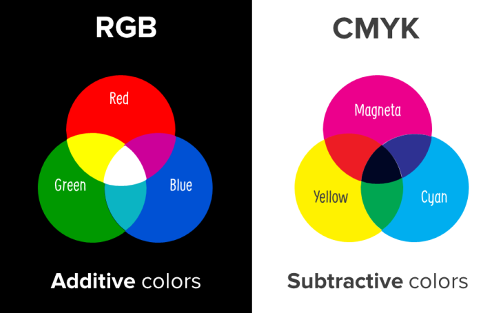
Color Space: Refers to the final output of a color. Rgb is typically used for illuminated color, while CMY is used for absorptive colors.
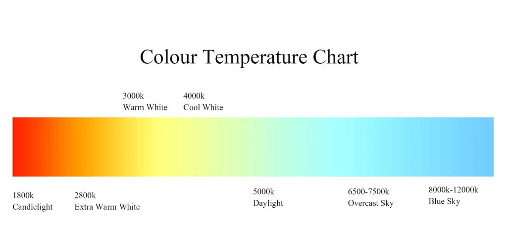
Color Temperature: Temperature of a light source, measured in kelvins. Lower temperatures are considered warmer (adding a yellow cast to objects), while higher temperatures are considered cooler (adding a blue cast to objects).
Hue: gradation of color within a visible spectrum.
Pantone: A color management system that is used to specify consistent color for prints, textiles, and paints.
Primary Colors: group of colors that, when mixed, can produce all other colors. primary colors cannot be made by other colors.
Secondary Colors: Colors that result from a 50 percent mixing of any two primary colors.
Saturation: intensity of a color, expressed as the degree to which it differs from white.
Schemes: Method of organizing color in harmonious combinations.
Shades: Result of adding more black to an existing color.
Tints: Result of adding more white to an existing color.
Tones: Result of mixing a color with its complement. An equal mix will result in a gray.
COLOR And SPACE
The process by which color is chosen and utilized in a design has a profound effect on interior space. The designer’s decisions can drastically change the spatial understanding of a project and also influence how it is navigated. When used with knowledge and intent, color can add perceived weight to surfaces, alter the basic proportions of a room, and variously be a calming or exciting factor. As the designer begins to explore and understand the surface effects of color, it will become the basis of a rich visual and material palette.
Volumetric Approaches to Color
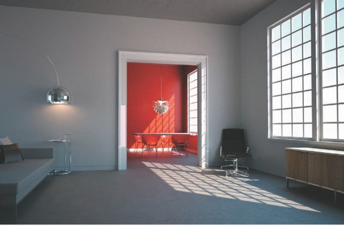
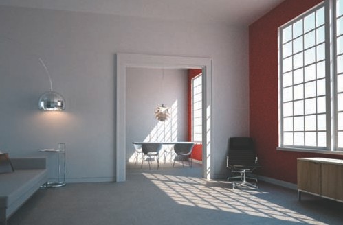
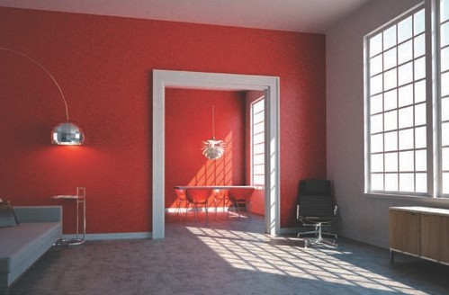
painting all aspects of a room the same color has the effect of volumizing the space. This method of using color can be particularly effective in making small spaces appear larger or more intimate depending on the color choices. Volumetric approaches work best in situations where they can be referenced in sequence, such as an enfilade, or series of rooms connected through doors.
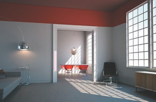
Elements such as furniture can emphasize the volumetric reading of a room. here, the chairs, matched with the red walls, draw attention to the room’s dimensions.
Planar Approaches to Color
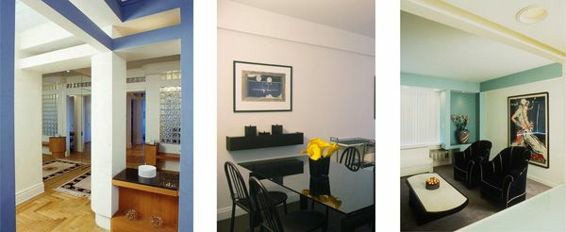
Color can be used to emphasize the planes in a given sequence of rooms or the vertical connection of spaces, as in a double-height room or loft. painting a length of wall regardless of interruption can lead the eye though the spaces of a design and highlight elements at the end of the wall—be it a light fixture, art, or furniture piece. Planar color can also make surfaces that are perpendicular to the occupant appear closer or further away.Painting a continuous length of a space with a single color emphasizes the planar elements within an environment.
Adding color to a sequence of parallel walls also reinforces the planar elements in a space.
Emphasizing Design Elements
Emphasizing the small-scale elements of a design—door and window trim, reveals at the ceiling, or the connection of materials—can draw the viewer’s attention to subtle aspects of the design that might be missed on initial inspection. painting elements such as reveals in the ceiling a darker color than adjacent objects can make the objects appear to float. Emphasizing the color of a door in a wall can cue the viewer to its importance. A red door in a white wall will seem more present in the room than a door within a wall of the same color.
Color can be employed to make certain aspects of a design stand out. For instance, elements such as trim, moldings, and furniture take on more significance when they are colored in stark contrast with their surroundings.
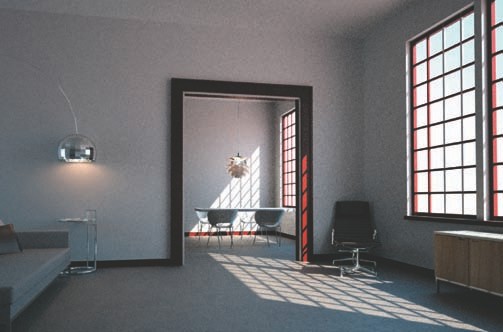
Transitions between spaces can be high- lighted by using very bold, bright hues, or made to recede when matched to the color of an adjacent surface.
Changing the Proportions of a Room
Color can change how the proportions of a room are perceived. Adding color to a certain datum, altering paint sheen, or darkening a room’s upper portions are some of the strategies by which the designer might play with spatial perception. Through the careful application of color, spaces can be made to appear smaller or larger, or an eccentric volume can be proportionally controlled. Using color in geometric and abstract patterns can further enhance a space. Adding color to the lower half of a space can provide a demarcation line for elements such as furniture and art.
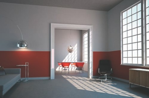
Adding color to the upper regions of a space can reduce the perceived height of a room.
Add Pops of Your Favorite Color to Unusual Places
One fun technique is to use a splash of your favorite color in an unexpected place. This method works best in settings where the furniture and walls are neutral, meaning colors such as white, black, gray, beige or ivory. (In general, neutral colors quiet a space by making it more recessive and less chaotic.) A pop of color may seem like a small change — and it is — but it packs a strong punch: It accentuates the color.


